A boy’s bedroom can go wrong in two very different ways. It can become too loud — all bright walls, busy bedding, plastic bins, and colors that feel exciting for one season but tiring after a while. Or it can become too plain. Safe gray walls. A basic bed. A few scattered toys. Nothing really wrong with it, but nothing that feels like him either. The better room usually sits somewhere in the middle. It has color, but not chaos. It feels playful, but not temporary. It gives him space to sleep, read, build, imagine, make a mess, clean it up, and slowly grow into the next version of himself. That is where paint becomes more powerful than people think. The right color can make a small room feel sharper, a messy room feel more organized, and a simple bedroom feel like it has a real point of view. You do not need to repaint every wall or follow every trend. Sometimes one checkered corner, one moody accent wall, or one warm neutral backdrop is enough to change the whole feeling of the room.
Start With the Problem Most Parents Actually Have
Most parents do not struggle because they have no ideas.
They struggle because they have too many.
One saved photo has a navy wall and striped bedding. Another has a checkered corner. Another has a green built-in desk. Then there is a room with sports prints, one with bunk beds, one with soft neutrals, one with bright orange shelves. After a while, everything starts to look possible, and that is exactly when the room becomes hard to design.
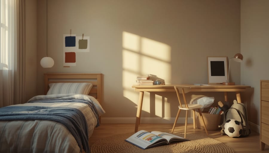
A boy’s bedroom also has a different kind of pressure. You want it to feel fun, but not babyish. You want color, but not a room that feels loud at bedtime. You want personality, but you also know his favorite thing today may not be his favorite thing next year.
That is why paint should not be chosen as a single exciting moment. It should be chosen as a small system.
Start with the feeling the room needs first.
Does he need a calmer room because bedtime is already a fight? Go softer on the walls and bring color into one zone.
Does the room feel flat and unfinished? Add contrast behind the bed or around the desk.
Is the room small and always messy? Use one strong color to create structure instead of adding more objects.
The best boys’ bedroom paint ideas do not begin with “What color looks cool?” They begin with a quieter question: what does this room need to do better?
Once you answer that, the color choices become much clearer.
Build a Color Story Before You Touch the Wall
Once you know what the room needs, do not rush straight to the paint aisle.
A bedroom usually feels better when the colors have jobs.
One color should carry the mood. This is the shade people notice first — the navy behind the bed, the olive around the reading corner, the smoky blue on the lower half of the wall.
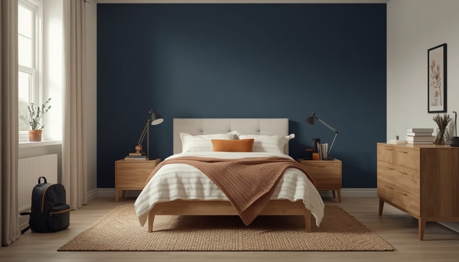
One color should calm everything down. This is usually a warm white, soft beige, pale gray, or creamy neutral that gives the eye somewhere to rest.
Then one small color can bring the room to life. Rust on a pillow. Mustard in a throw blanket. Brick red in a framed print. A little black through a lamp, picture frame, or drawer pull.
This matters because boys’ bedrooms collect visual noise quickly. A superhero book on the nightstand. A red water bottle. A pile of Lego pieces. A school backpack. A trophy from last season. None of those things are a problem on their own, but together they can make the room feel busier than the wall color ever intended.
A clear color story gives all of that everyday stuff a place to land.
Navy feels cleaner with oak, cream, and a small hit of rust. Olive feels warmer with tan, black, and natural woven texture. Charcoal feels less heavy when it is balanced with white bedding and a lighter rug. Sky blue grows up when it is paired with clay, gray, and simple wood furniture.
The room does not need to match perfectly. It just needs a few colors that keep repeating in quiet ways, so the space feels connected even on the days when the bed is not made.
Use the Checkered Wall Carefully
The checkered wall is easy to love because it has instant personality.
It makes a plain bedroom feel designed. It gives the room rhythm. It can make a simple bed wall, reading corner, or desk area feel like its own little world.
But it can also go wrong fast.
Small, high-contrast checks across a full wall can feel busy before the room is even furnished. Add patterned bedding, open toys, sports gear, books, and school things, and suddenly the wall is competing with everything else in the room.
A better version is usually quieter.
Try larger checks instead of tiny ones. Keep the colors close enough that they feel layered, not loud. Warm white with soft beige. Olive with a dusty sage. Navy with a faded blue-gray. Clay with cream. Charcoal with a gentle mushroom tone.
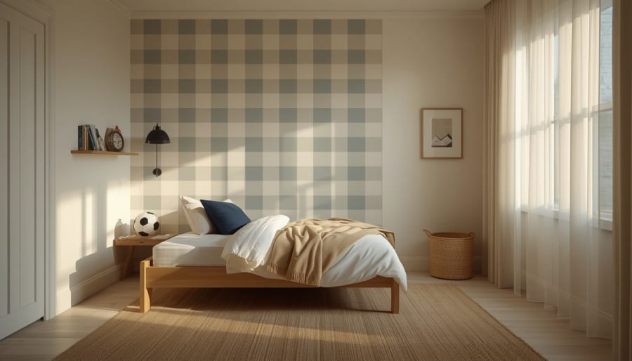
The checkered pattern does not have to cover the whole room to make a point. It can sit behind the headboard, wrap one reading nook, or stop halfway up the wall like a modern painted panel. That small limit is what makes it feel intentional.
In a younger boy’s room, checks can bring playfulness without needing a theme. In an older boy’s room, the same pattern can feel graphic and cool when the palette is more muted.
That is the sweet spot — a wall with energy, but not a wall that takes over the room.
Give Bold Colors a Place to Belong
Bold color works best when it has a reason to be there.
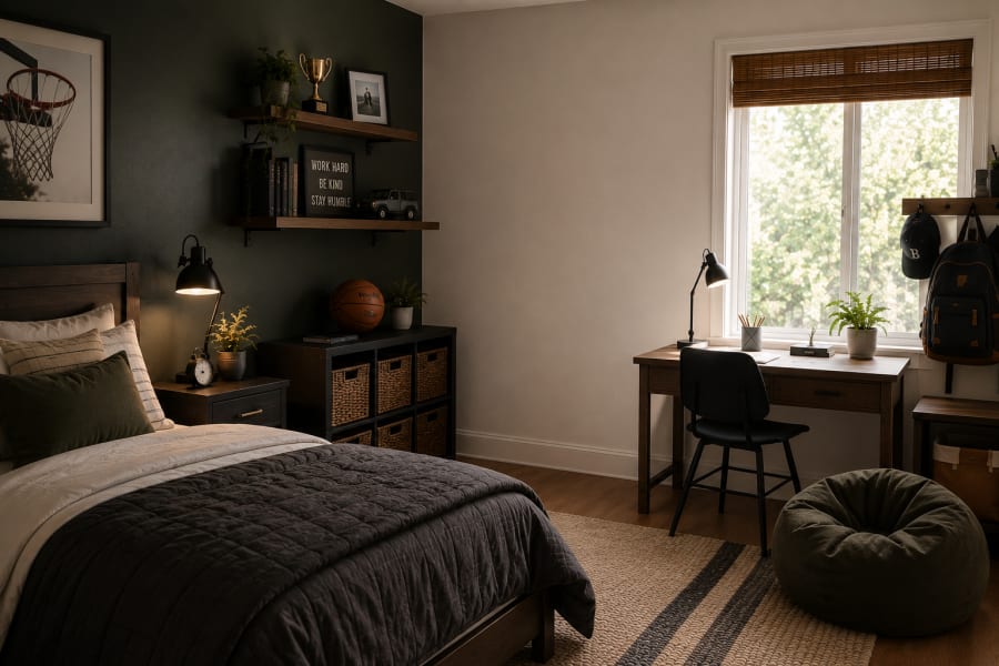
A deep green wall around a desk can make homework feel more grounded. A navy wall behind the bed can make the sleep area feel calmer at night. A clay-colored corner near a low bookshelf can turn a forgotten spot into a reading nook.
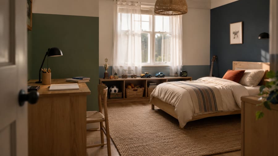
This is where paint becomes more useful than decoration.
Instead of painting one wall because the room “needs something,” use color to explain the room. Where does he sleep? Where does he build? Where does he read? Where does the mess usually happen? Those questions tell you where the stronger color should go.
In a small bedroom, this can make a big difference. A darker shade behind the bed can visually anchor the room so the bed does not feel like it is floating. A painted half-wall can make low storage look more intentional. A soft color block around a desk can separate schoolwork from play without adding another piece of furniture.
The room starts to feel less like one box with furniture pushed against the walls, and more like a few small zones that make sense.
That is especially helpful for boys who use their bedroom for everything. Sleep happens there, but so do projects, reading, drawing, collections, toy storage, sports gear, and quiet time. Color can gently organize all of that before a single bin or shelf is added.
The best part is that these painted zones can change later. A play corner can become a study wall. A reading nook can become a music corner. A soft blue half-wall can stay even when the bedding, posters, and interests change.
Choose Colors That Can Grow Up With Him
A boy’s room does not need to look grown-up too early. It should still have some spark.
But the parts that are hardest to change — the wall color, the larger furniture, the rug — usually work better when they are not tied too tightly to one age.
That is where many bedrooms start to feel dated quickly. The bright race-car red wall feels exciting at five, but too intense by nine. A full superhero palette can be fun for a while, then suddenly the room feels younger than he is. Even very trendy colors can start to feel tired if every surface is built around them.
The safer move is not to remove personality. It is to put personality in places that are easier to change.
Let the walls carry a stronger but steadier color: navy, smoky blue, olive, warm gray, clay, deep teal, soft charcoal, or a rich beige that does not feel flat. These shades still have mood. They still photograph beautifully. They still feel current. But they do not lock the room into one short phase.
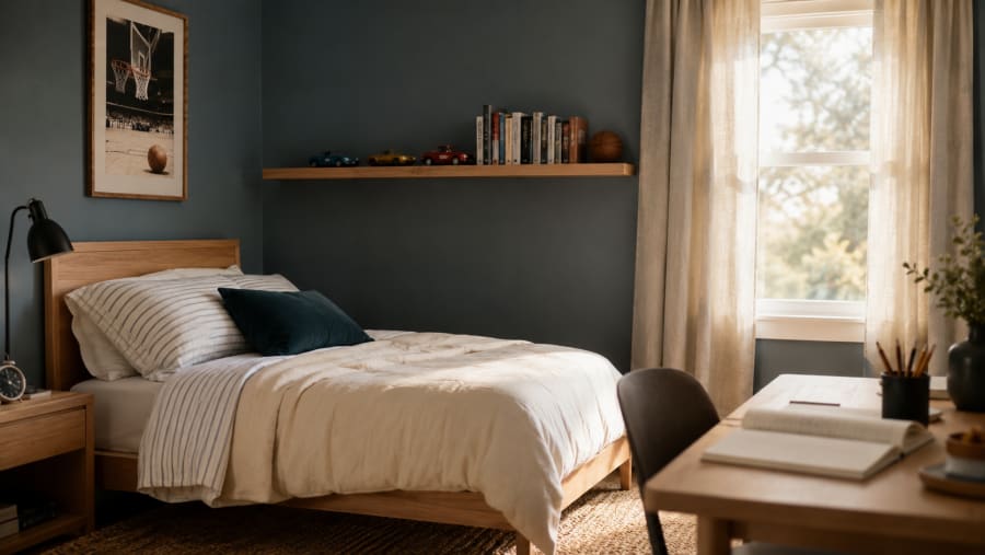
Then let the changeable pieces bring in the louder energy.
Bedding can shift from dinosaurs to stripes. Wall art can move from cartoons to sports prints. A small chair can change color. A shelf can hold toy cars now and books later. The room keeps its bones, but the personality keeps moving with him.
This is the kind of bedroom that feels practical in the best way. Not boring. Not overly careful. Just built with enough patience that it does not need to be started from scratch every time his interests change.
A room that grows well usually has one quiet rule: make the background strong, and let the details do the changing.
Use Texture So the Paint Does Not Have to Do Everything
Paint can change the room quickly, but paint alone rarely makes a bedroom feel finished.
That is the part people sometimes miss. They choose a beautiful color, paint the wall, step back, and wonder why the room still feels a little flat.
The answer is usually texture.
A navy wall feels softer when there is cotton bedding in front of it. Olive paint looks warmer beside light oak, woven storage, and a rug with a natural fiber feel. Charcoal becomes easier to live with when the bedding is light, the curtains are simple, and the room has enough wood to stop it from feeling cold.
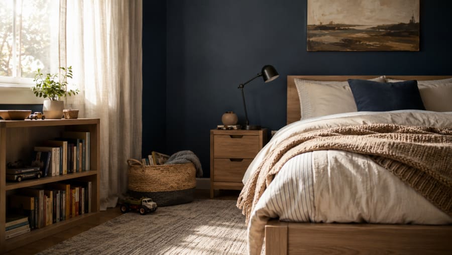
Texture gives bold color something to sit with.
It also helps a boy’s bedroom feel more real. A perfectly painted wall can look nice, but a room becomes personal through the things he touches every day — the blanket he pulls up at night, the rug where he sits with books or building blocks, the shelf where he lines up small collections, the basket that catches whatever was on the floor five minutes ago.
This is why the best painted bedrooms do not look overly decorated. They look layered.
Not crowded. Not themed. Just layered enough that the color feels connected to the room instead of sitting on the wall by itself.
If the paint is strong, keep the textures honest. Cotton, linen, wood, canvas, woven fibers, matte metal, and soft wool-like rugs usually age better than shiny finishes or plastic-heavy decor. They make the space feel warmer without making it feel busy.
A boys’ bedroom should be able to handle real life. Texture is what helps it feel designed even when the room is being used exactly the way a kid uses it.
Let Paint Help With the Mess
Some bedrooms do not need more decor. They need clearer places for things to land.
This is where paint can quietly help.
A painted half-wall behind low storage can make toy bins look like they belong there instead of looking like an afterthought. A darker shade behind open shelves can make books, trophies, models, and small collections feel more contained. A soft color block around a desk can make school supplies feel less scattered because the whole area suddenly has a boundary.
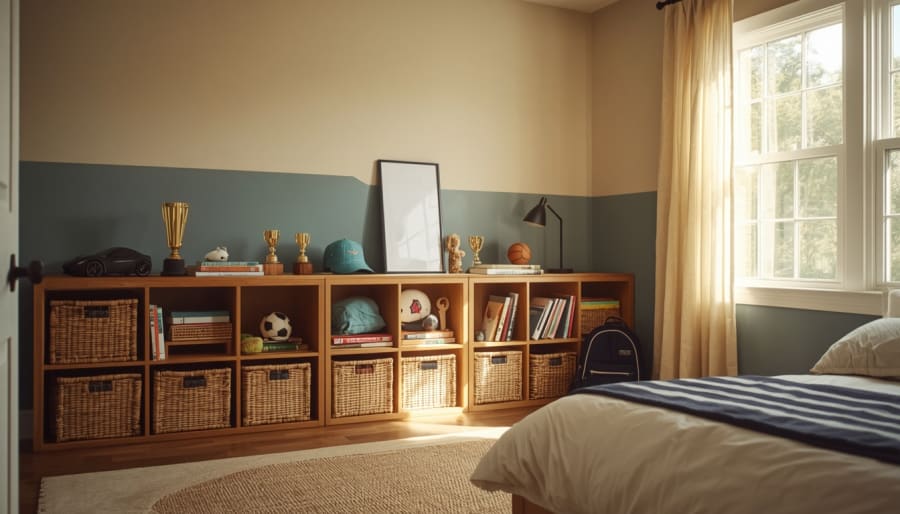
The mess is still real. Paint does not fold laundry or put books back on the shelf.
But it can make the room easier to read.
That matters in a child’s room because clutter often feels worse when every corner has the same visual weight. The bed, desk, closet, toy pile, bookshelf, and floor all start competing. A few simple paint choices can tell the eye where to focus and where to rest.
For a small room, try painting the lower third of the wall in a slightly deeper shade and placing storage against it. The darker band grounds the room and makes low baskets or cubbies feel intentional. For a room with open shelves, paint the wall behind them a warmer neutral or muted blue so the objects feel framed, not scattered. For a homework corner, use one quiet color around the desk so that pencils, notebooks, chargers, and papers feel like part of a zone rather than random clutter.
A well-painted room will not stay perfect.
That is not the point.
The point is to make everyday mess look manageable, so the room still feels good on a normal Tuesday night, with a backpack by the door and a half-finished project on the desk.
Paint Palettes That Actually Work in a Boy’s Bedroom
A good palette should do two things at once.
It should give the room a clear mood, and it should leave enough space for real life — the books, the sneakers, the odd-colored water bottle, the blanket he refuses to stop using, the small things that make the room his.
Here are a few color directions that feel current without becoming too fragile.
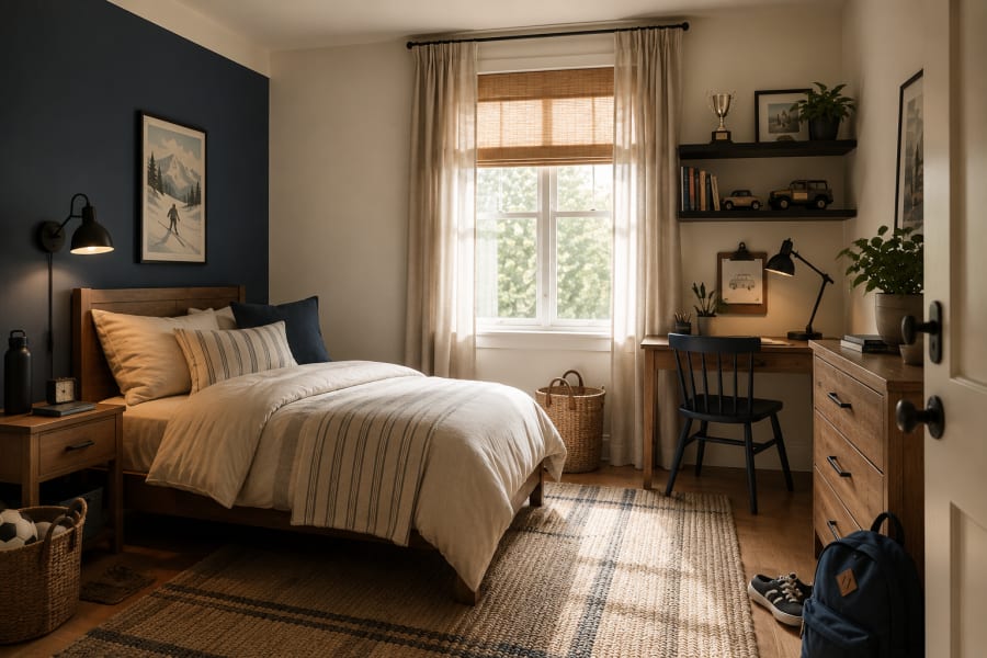
Navy, Cream, Oak, and Rust
This is one of the easiest palettes to live with because it has contrast without feeling cold.
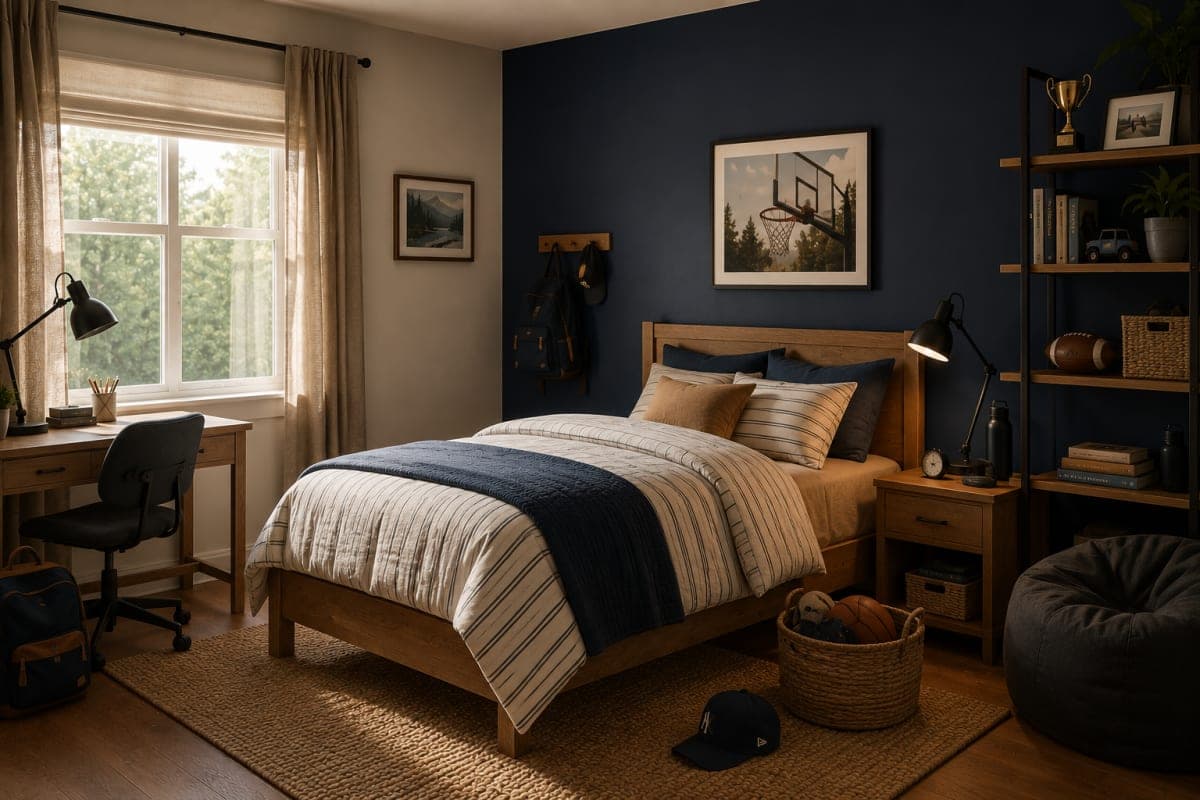
Use navy behind the bed or on the lower half of the wall. Keep the rest of the room creamy and warm. Add light oak furniture so the dark paint does not feel too serious. A little rust in the bedding or artwork keeps the room from feeling flat.
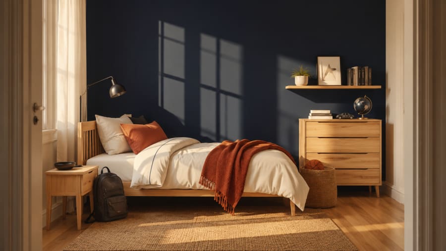
This palette works especially well for boys who are getting older but still need the room to feel relaxed, not adult.
Olive, Warm White, Black, and Tan
Olive green brings a grounded feeling that works beautifully in a bedroom. It is colorful, but it does not shout.
Pair it with warm white walls, tan bedding, a black lamp, and a few woven textures. The room starts to feel calm, natural, and slightly outdoorsy without turning into a theme.
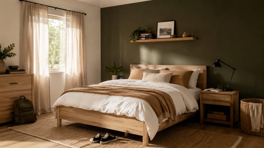
It is a good choice when you want something more interesting than gray but still easy to build around.
Smoky Blue, Soft Gray, Clay, and Wood
Smoky blue has a quiet confidence. It feels young enough for a child’s room, but not so sweet that it becomes hard to update later.
Bring in soft gray through a rug or curtain, then add clay or terracotta in one small place — a pillow, a print, or a throw. Wood furniture keeps it warm.
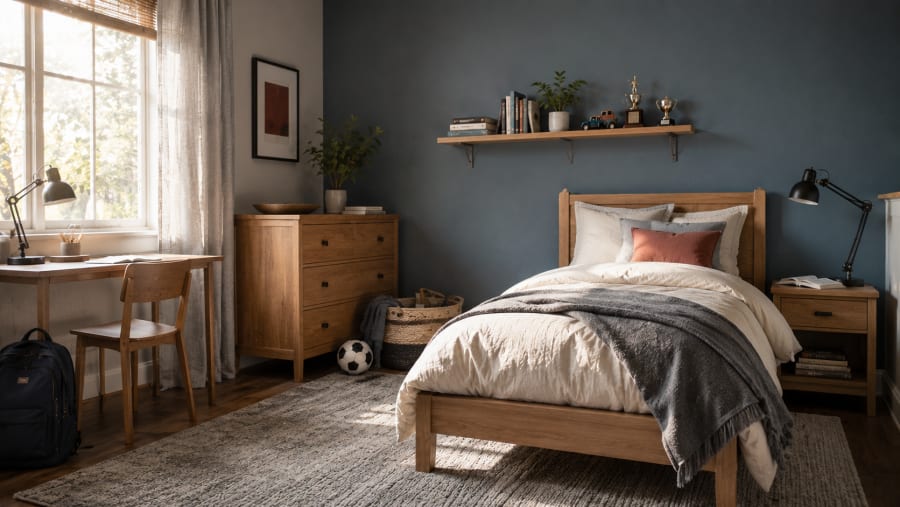
This palette is especially helpful in rooms that get good daylight, because the blue shifts gently throughout the day.
Charcoal, White, Walnut, and Denim
Charcoal can work in a boy’s bedroom if the room has enough softness around it.
Use it carefully. Behind a bed, around a desk, or as a painted panel — not necessarily on every wall. White bedding, walnut tones, denim blue accents, and soft lighting make the color feel modern instead of heavy.
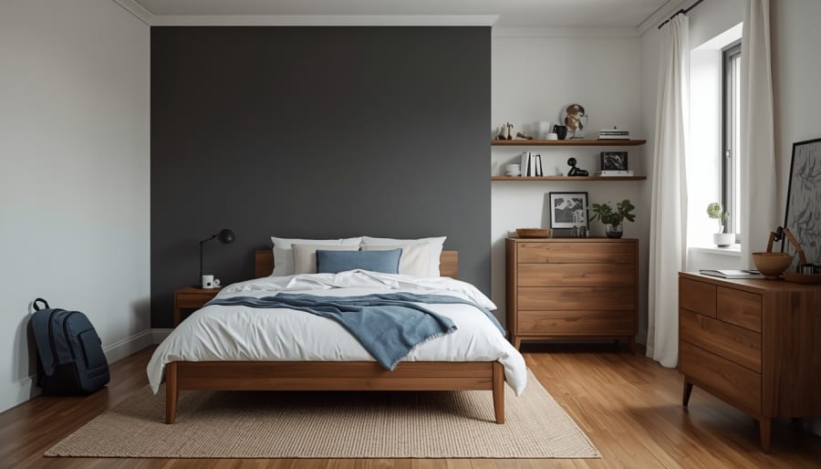
This is a strong option for an older boy’s room or a space that needs a sharper edge.
Clay, Cream, Natural Wood, and Faded Blue
Clay is warm, earthy, and less expected than standard blue or gray.
It works well when the rest of the room stays simple: cream walls, natural wood, a faded blue blanket, maybe a striped pillow. The result feels warm and creative without leaning too bright.
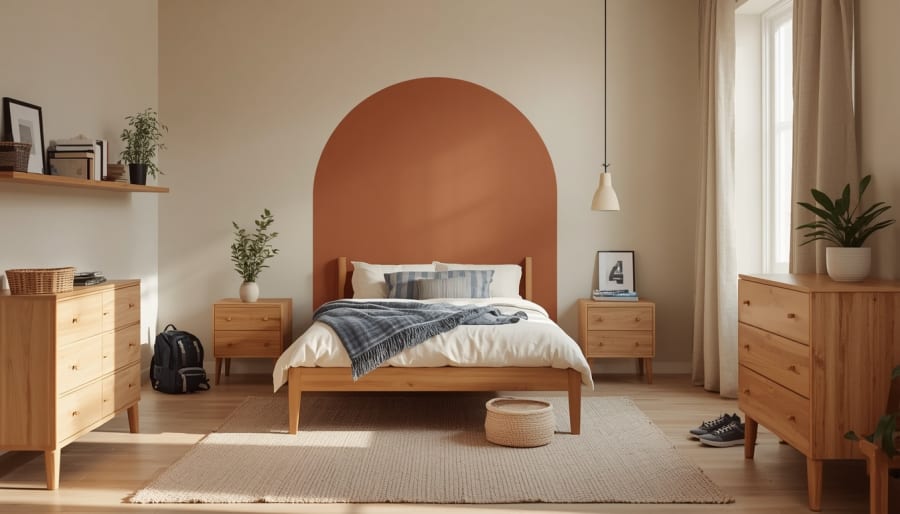
This palette is lovely for a room that needs more personality but still has to feel restful at night.
Sage, Beige, White, and Soft Black
Sage is gentle, but it can still feel fresh when it is not overly sweet.
Use it for a half-wall, a desk nook, or an accent behind shelves. Beige and white keep the room easy. A few soft black details — a lamp, frame, or drawer pull — give it shape.
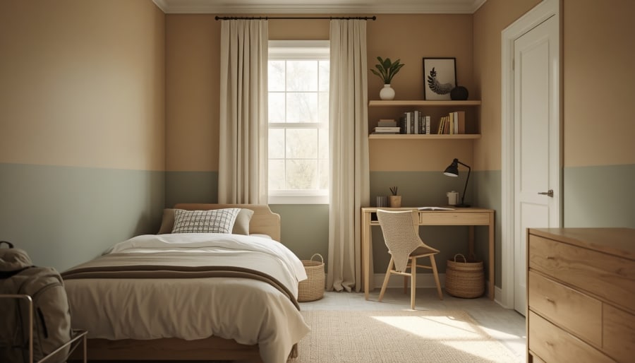
This palette works well for smaller bedrooms because it adds color without making the room feel tighter.
None of these palettes needs to be followed perfectly. The point is not to copy a room from a photo. The point is to choose a few colors that keep the bedroom steady, even when everything inside it changes from one year to the next.
The Small Details Decide Whether the Paint Feels Finished
Paint gives the room its direction, but the smaller choices decide whether that direction feels complete.
This does not mean the room needs more things. Most boys’ bedrooms already have enough things. What they usually need is better editing.
A dark painted wall looks more intentional when the bedding is simple. A checkered corner feels calmer when the rest of the patterns stay quiet. A painted desk nook works better when the lamp, chair, and storage all feel like they belong to that little area.
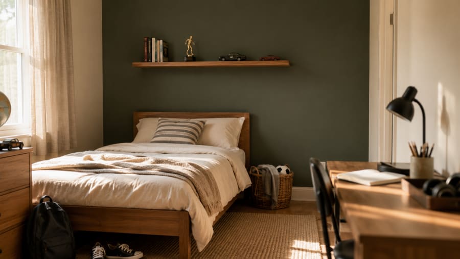
The mistake is trying to make every detail exciting.
One bold wall, one patterned rug, one colorful bedding set, one gallery wall, one themed lamp, one printed curtain — each piece may look fine alone, but together they start fighting for attention.
Let one idea lead.
If the paint is the strongest part of the room, keep the bedding breathable. If the bedding has stripes or checks, let the walls stay steadier. If the shelves hold books, trophies, toy cars, and small collections, give the wall behind them a calmer shade so the objects feel framed instead of scattered.
This is also where organization becomes part of the styling, not a separate chore.
A low basket beside the bed. A shelf that gives small collections a home. A desk tray for pencils, headphones, and the little things that always disappear. These pieces do not need to announce themselves. They just need to make the room easier to use.
A finished room is not a room where everything matches.
It is a room where the eye knows what matters first, what belongs together, and where the everyday mess is allowed to live without taking over.
Make the Room Easy to Change Later
The best boys’ bedroom paint ideas leave a little breathing room for the future.
That does not mean the room should be bland. It means the biggest choices should not trap the room in one short season of his life.
A painted wall can stay. A good neutral can stay. A simple wood bed can stay. The rug, bedding, art, lamp, baskets, and shelves can change around those things without making the whole room feel wrong.
This is why a room with a steady base often feels more expensive than a room full of themed pieces. It has patience built into it.
Maybe the navy wall works with striped bedding now and a denim quilt later. Maybe the olive desk nook holds crayons today and a laptop in a few years. Maybe the checkered corner feels playful when he is small, then graphic and cool when the rest of the room becomes simpler.
That is a better kind of design.
A boy’s bedroom should not be frozen at one age. It should be able to move with him, quietly and naturally, without asking you to start over every time he changes his mind.
So choose the color with care, but do not ask it to do everything. Let the walls create the feeling. Let the furniture give the room structure. Let the small details carry the season he is in right now.
That balance is what makes the room feel personal today and still useful tomorrow.
Think About the Room at Night, Not Just in Daylight
Paint is usually chosen in daylight.
That makes sense. Daylight is when colors feel most honest. You can see the undertones, the shadows, the way a blue leans gray or a beige turns yellow.
But a boy’s bedroom has to work at night too.
That is when the room needs to slow down. The toys are still there. The books are still there. The school bag may still be on the floor. But the feeling of the room should start to soften.
Some colors handle this better than others.
Navy can feel quiet and protective at night, especially with warm white bedding and a small reading lamp. Olive becomes cozy when the light is low and the room has natural textures around it. Clay can feel warm without becoming too bright if the lamp light is soft. Even charcoal can work beautifully when it is used with care and balanced by white bedding, wood furniture, and gentle lighting.
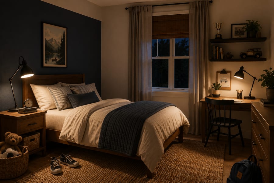
The mistake is using cool, harsh lighting after choosing a beautiful wall color.
A strong paint color under a cold bulb can suddenly feel flat, gray, or too sharp. A softer bulb changes everything. It makes the wall feel warmer, the bedding more inviting, and the room less like a bright activity zone.
For a boy who reads before bed, keeps a nightstand full of little things, or needs the room to feel calmer at the end of the day, lighting should be part of the paint decision from the beginning.
Test the color in the morning.
Look at it again in the afternoon.
Then turn on the lamp at night.
That last moment often tells you more than the paint chip ever will.
Keep the Theme Loose
A themed bedroom can be fun in the beginning.
The problem is not the theme itself. The problem is when the theme gets too literal.
A sports room does not need a soccer mural, soccer bedding, soccer curtains, soccer lamps, and a wall full of decals. An outdoorsy room does not need trees on every surface. A space-themed room does not need planets on the rug, stars on the ceiling, and rocket bedding all at once.
That kind of room usually has a short life.
A looser theme lasts longer because it gives the room a feeling instead of a costume.
If he loves sports, let the room feel active through color, storage, and a few personal pieces. Maybe a deep blue wall, a framed jersey, a low basket for balls, and bedding that stays simple.
If he loves nature, use olive, tan, wood, woven texture, and one good landscape print instead of turning the room into a forest.
If he loves building, drawing, or collecting small things, give him shelves, a desk zone, and a wall color that makes those objects feel special without making the room too busy.
This is where paint can do something very useful. It can suggest the mood without making the room depend on one interest.
A navy wall can feel sporty, classic, or older depending on what you place near it. Olive can feel outdoorsy without becoming a camping room. Clay can feel creative without turning the bedroom into an art studio. Charcoal can feel sharp without making the room too serious.
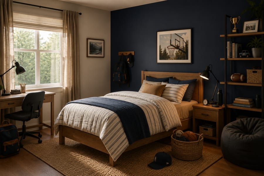
Children change fast. The room should be allowed to change with them.
A loose theme gives him personality now, and freedom later.
Test the Color Where Real Life Happens
A paint chip can lie a little.
Not on purpose. It just cannot show you what the color will do beside the bed, under the window, near the closet, or behind the desk where the light disappears by evening.
A smoky blue that looks perfect in the store may turn too cool on the shadowed wall. A warm beige may look calm in daylight and slightly yellow at night. Olive can feel grounded in one room and too dark in another if there is not enough natural light.
This is why the final choice should happen in the room, not in your hand.
Paint a few sample patches where the color will actually live. One near the bed. One near the window. One beside the desk or shelf. Then leave them there for a few days.
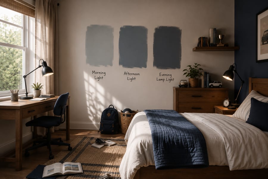
Look at them in the morning when the room is fresh.
Look again in the afternoon when the sun moves across the wall.
Look one more time at night with the lamp on.
The right color usually feels good in more than one moment. It does not only look pretty at noon. It still feels comfortable when the room is dim, when the bedding is rumpled, when the backpack is on the floor, when the toys are out, when the room is being used like a real room.
That is the test that matters.
Not whether the color is trendy.
Whether it still feels right after the room starts living with it.
Do Not Let the Paint Fight the Bed
In most boys’ bedrooms, the bed takes up the most visual space.
That sounds obvious, but it is easy to forget when you are focused on the wall color.
A beautiful paint color can lose its effect if the bedding is too busy. The wall may be calm, but the room still feels loud because the bed is covered in heavy patterns, bright colors, or a theme that pulls attention away from everything else.
This does not mean the bedding has to be plain.
It just needs to know its role.
If the wall is bold, let the bed soften it. Cream cotton, a simple stripe, a quiet plaid, denim blue, tan, beige, or a textured quilt can give the room warmth without making it noisy.
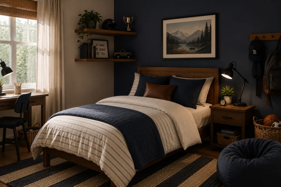
If the wall is lighter, the bedding can carry more personality. A striped duvet, a rust throw, a faded blue blanket, or a darker pillow can bring enough contrast without repainting the room.
The balance matters because the bed is where the room should visually slow down.
Even in a playful bedroom, the sleep area needs some calm. That one choice changes the feeling of the whole space. A navy wall with soft bedding feels protective. Olive with warm white bedding feels grounded. Clay with cream bedding feels warm but not too bright. Charcoal with white bedding feels sharp but still comfortable.
When the wall and bed work together, the room starts to feel settled.
Not decorated for a photo.
Settled in the way a good bedroom should be — ready for reading, sleeping, daydreaming, and the ordinary end of a long day.
Give Storage the Same Attention as the Wall Color
Paint can make the room feel better, but storage decides whether that feeling lasts.
This is the part that usually shows up after the room is finished. The wall looks great. The bedding works. The lamp is in the right place. Then, a few days later, the floor starts collecting everything the room never made space for.
Sports gear. Books. Hoodies. Small toys. School papers. Chargers. Shoes. The things are normal. The problem is when none of them has an obvious home.
That is why storage should be planned with the paint, not added later as a rescue mission.
If you paint a half-wall, place low storage against it so the whole area feels built in. If you create a reading corner, give that corner a basket for books and blankets. If the desk has a painted zone around it, add one tray or small organizer so pencils, headphones, and loose papers do not take over the surface.
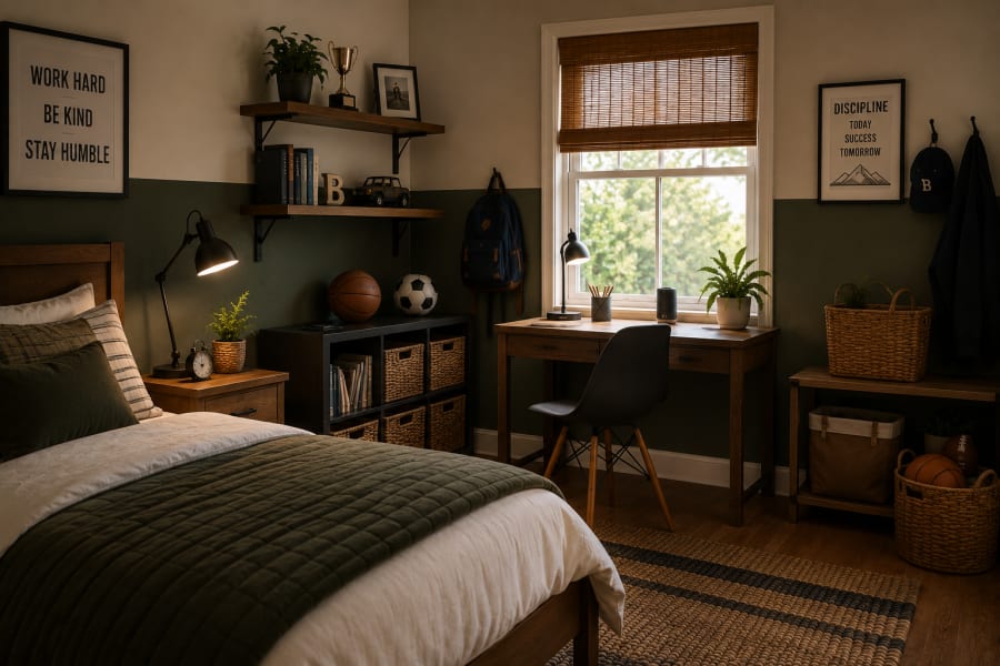
Storage does not need to look precious in a boy’s room. It needs to be easy enough that he might actually use it.
Open shelves work for things he likes to see. Baskets work for things that never look neat. A nightstand drawer works for the small objects that somehow matter deeply. Hooks are better than wishful thinking when it comes to backpacks, caps, and jackets.
The best storage blends into the room’s color story instead of shouting for attention. Woven texture with olive. Light oak with navy. Soft black hooks against warm white. A simple canvas bin under a desk.
When storage belongs visually, the room can look calmer even when life is happening inside it.
Leave One Wall Quiet
Not every wall needs to explain itself.
That may be the most useful thing to remember when painting a boy’s bedroom.
A room can have one strong color, one patterned moment, one desk nook, one shelf wall, one piece of art. It does not need all of them fighting for the same attention.
A quiet wall gives the room somewhere to breathe.
It also gives the child somewhere to grow. Today that empty wall may hold nothing. Later it may hold a corkboard, a poster, a framed jersey, a bookshelf, a reading light, or a row of hooks for backpacks and caps.
When every wall is already finished, there is no room left for his real life to show up.
This is especially true in smaller bedrooms. A bold wall behind the bed can feel beautiful, but if every other surface is also busy, the room starts to feel boxed in. A warm white wall, a soft beige wall, or even a simple unpainted corner can make the stronger color feel more confident.
Restraint is not the same as plainness.
It is what lets the best idea in the room actually be seen.
So if you choose a checkered accent, let another wall stay simple. If the desk nook has color, keep the sleep area softer. If the bed wall is navy or olive or clay, let the side walls support it instead of competing with it.
The quiet wall is not wasted space.
It is the pause that makes the rest of the room work.
Final Thoughts
A boy’s bedroom does not need to be louder to feel special.
It needs to feel understood.
That is the difference between a room that looks exciting for a few weeks and a room that keeps working quietly in the background of his everyday life. The better room gives him color, but not too much noise. It gives him personality, but not a theme he will outgrow too quickly. It gives him places to sleep, read, study, build, collect, drop his backpack, and come back to himself at the end of the day.
Paint is only the beginning, but it is a powerful beginning.
A navy wall can make the bed feel settled. Olive can bring calm without becoming boring. Smoky blue can soften the light. Clay can warm up a plain room. Charcoal can give an older boy’s space a sharper edge. A checkered wall can add playfulness when it is handled with restraint.
The color does not have to be perfect forever.
It just has to give the room a strong enough base for real life to keep changing around it.
That is the kind of boys’ bedroom that feels good now and still makes sense later — not overly designed, not too safe, not trying too hard. Just a room with a little courage, a little order, and enough space for him to grow.
Editor's Note
A boys’ bedroom does not need to chase every color trend to feel fresh. The best rooms usually begin with one honest question: what does this space need to do better? Choose a color that helps the room feel calmer, clearer, or more personal. Then let the bedding, storage, lighting, and small details support that choice quietly. When the room has a strong base and enough breathing room, it can grow with him instead of being redesigned every time his interests change.
Curated Finds
Shop This Style
A few thoughtful pieces that help recreate the mood of this room — chosen for texture, usefulness, and a calmer everyday home.
Storage
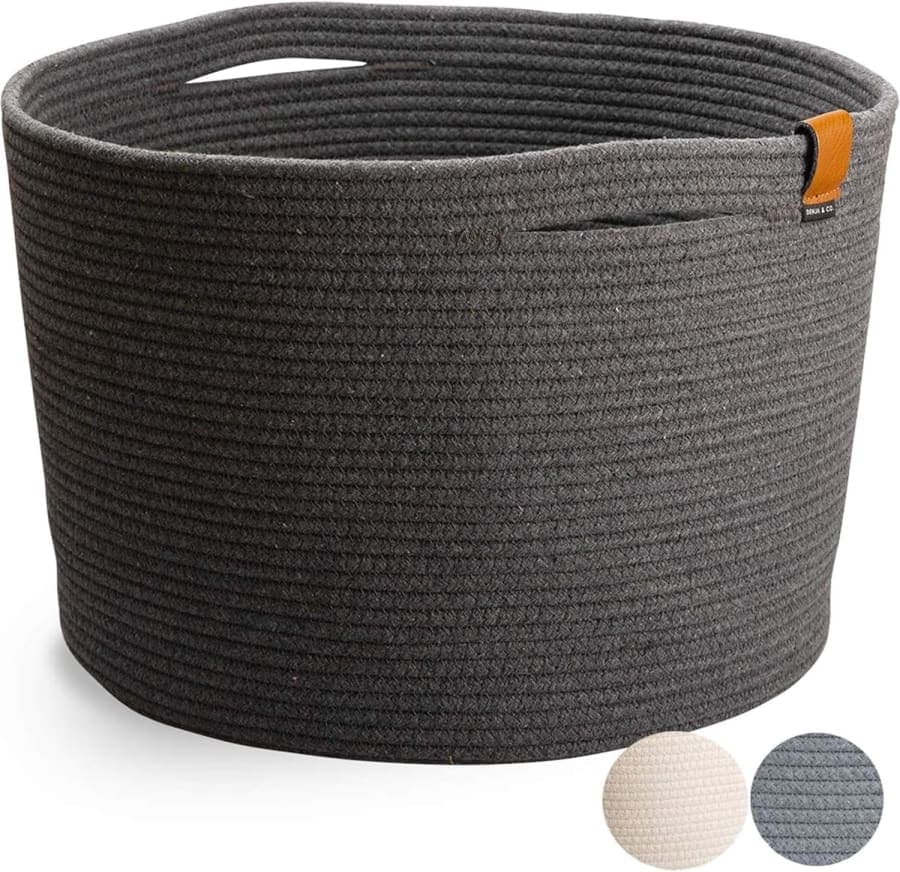
Charcoal Woven Storage Basket
Adds soft woven texture and practical storage for shoes, blankets, toys, and daily clutter.
Why it works
A charcoal woven storage basket fits this room because it gives toys, blankets, or sports gear a clean place to land while adding the soft dark contrast that makes a painted boys’ bedroom feel more finished.
Bath
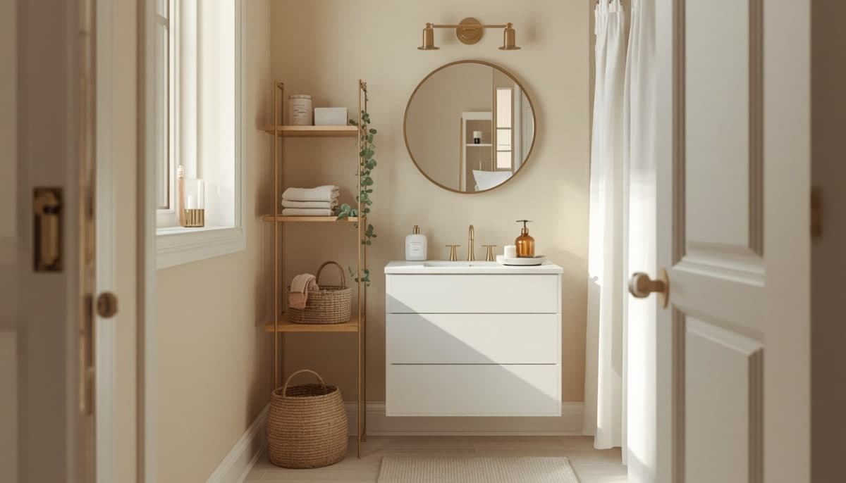
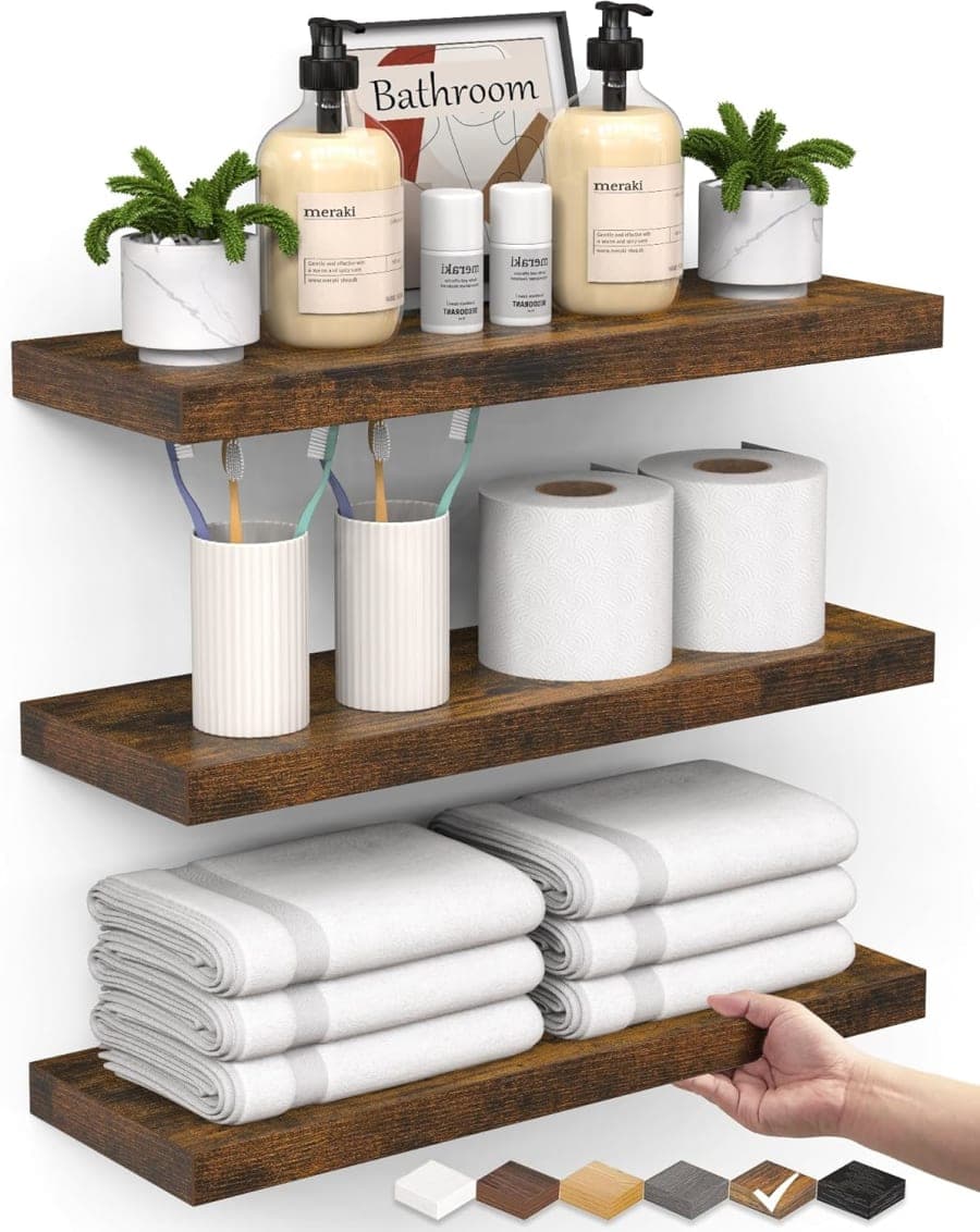
Rustic Bathroom Floating Shelves
Adds vertical storage and warm rustic style to a small bathroom without taking up floor space.
Why it works
A rustic bathroom floating shelf can also work in this article as a bedroom wall shelf alternative because the warm wood tone gives books, trophies, small collections, or framed art a simple place to live without making the room feel crowded.
Wall Decor
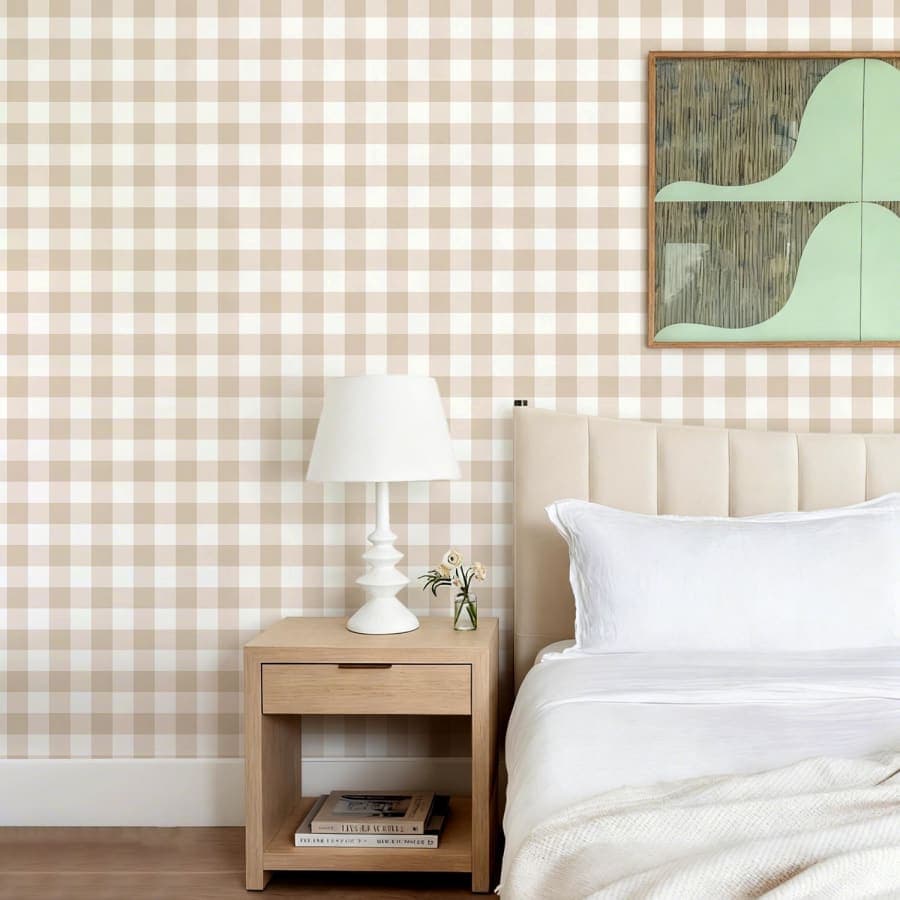
Beige Checkered Peel and Stick Wallpaper
A soft removable wallpaper that brings warm pattern and easy character to plain walls.
Why it works
A beige checkered peel-and-stick wallpaper is worth recommending because it gives the room that playful Pinterest-style pattern without making the walls feel loud, and it can be removed later when his room needs a new direction.

VibeHaven Editorial
Thoughtful notes for creating a home that feels calm, useful, and warmly lived in. We look for simple styling choices, quiet organization ideas, and everyday pieces that add beauty without visual noise.
Category
Styling Ideas
Read Time
8 min read